
Second Talent | Web Design
Second Talent is a recruitment startup based in Hong Kong. The company aims to connect tech talents in Southeast Asia to international hirers. I was commissioned to revamp their marketing website currently hosted by Wix.
Visit www.secondtalent.com to explore the live site.
Team
Web Design | Me
Graphic Design | Don Li
Project Manager | Silvia Su
TIMELINE
4 weeks,
January 2023
TOOLS USED
Figma, Wix
Design Brief
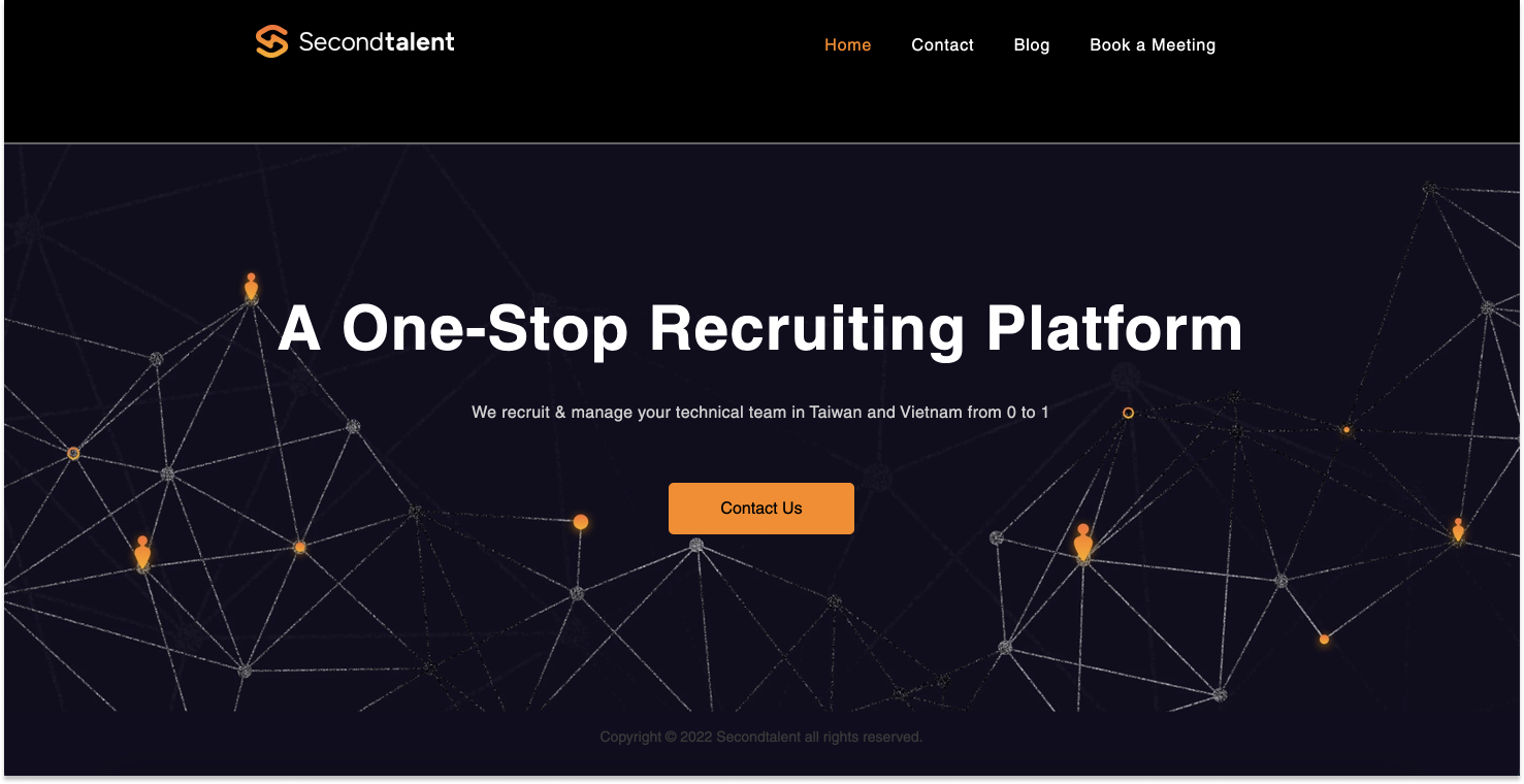
Site before interventionThe client wants the website to help widen their customer funnel. The current site was launched during November 2022. Our client told us that customers has expressed difficulty “to understand what the business really do as a lot information are missing”.
In fact, the site is oversimplified with only three pages:
Landing page with only the hero banner
A blog page
A unlinked contact us button
Our design goal is to engage outbound customers through improved site architecture and call-to-action user journey.
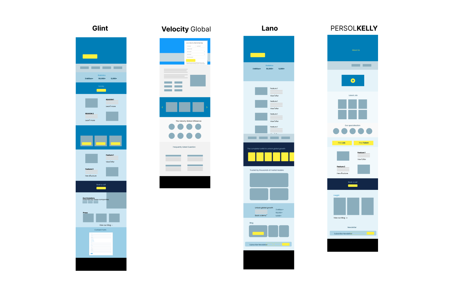
01 - Comparative Research
Evaluate other recruitment agencies to help me better contextualize the language and conventions for recruitment companies.
Key findings from this exercise:
Most sites would have a main call-to-action (e.g. reoccurring button) leading to a contact form.
Free factsheets on regional employment to demonstrate knowledge.
A lot contextual and procedural information presented in charts, timelines and tabs. Textual information can quickly exhaust user’s attention span.
01. Sitemap analysis
Second Talent Sitemap

The map informs what tasks should be prioritized first:
First - Call-to-action: “Contact us” user flow
Deliverable: Linked button and functional contact form
Secondary -Content: Homepage -> Solution (subpages) ->Resources (subpages)
Deliverable: iterations of Prototypes and Copywriting
Third - Next Phase: Events and Success stories templates (if time permits)
Deliverable: Reusable templates
02. Content Flow
Comparing content structure of different companies. This allows me to grasp the what types of contents go together. I understood that it is common to include:
interactive components (e.g. buttons)
Media (Video / Photos)
Text
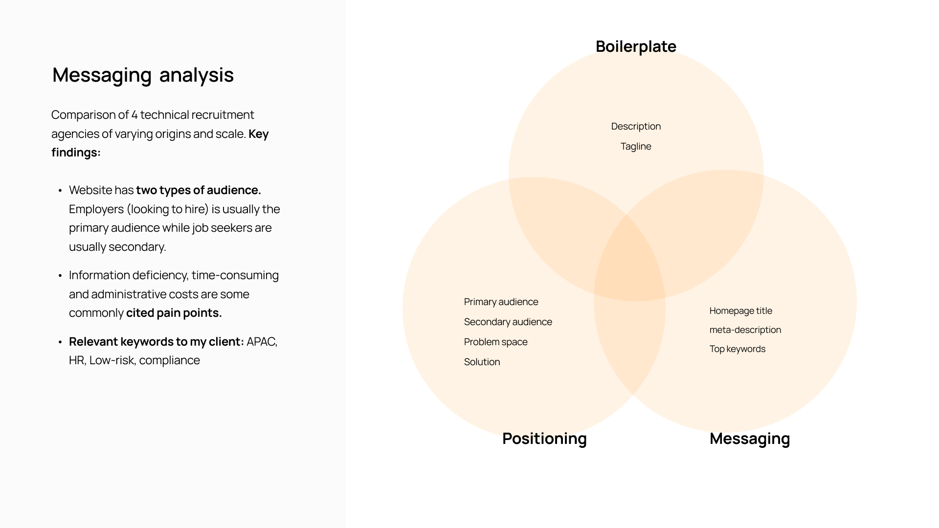
03. Competitors messaging analysis
02- Development
01. Wireframes
02. Color Injection

03. UI System
-
![]()
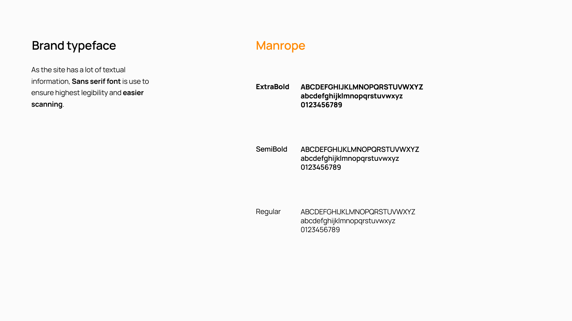
Brand Typeface
-
![]()
Typescale
-
![]()
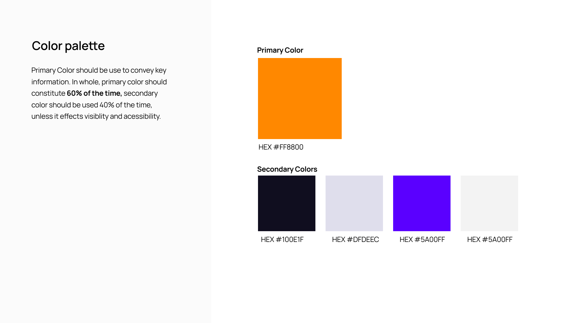
Color palette
-
![]()
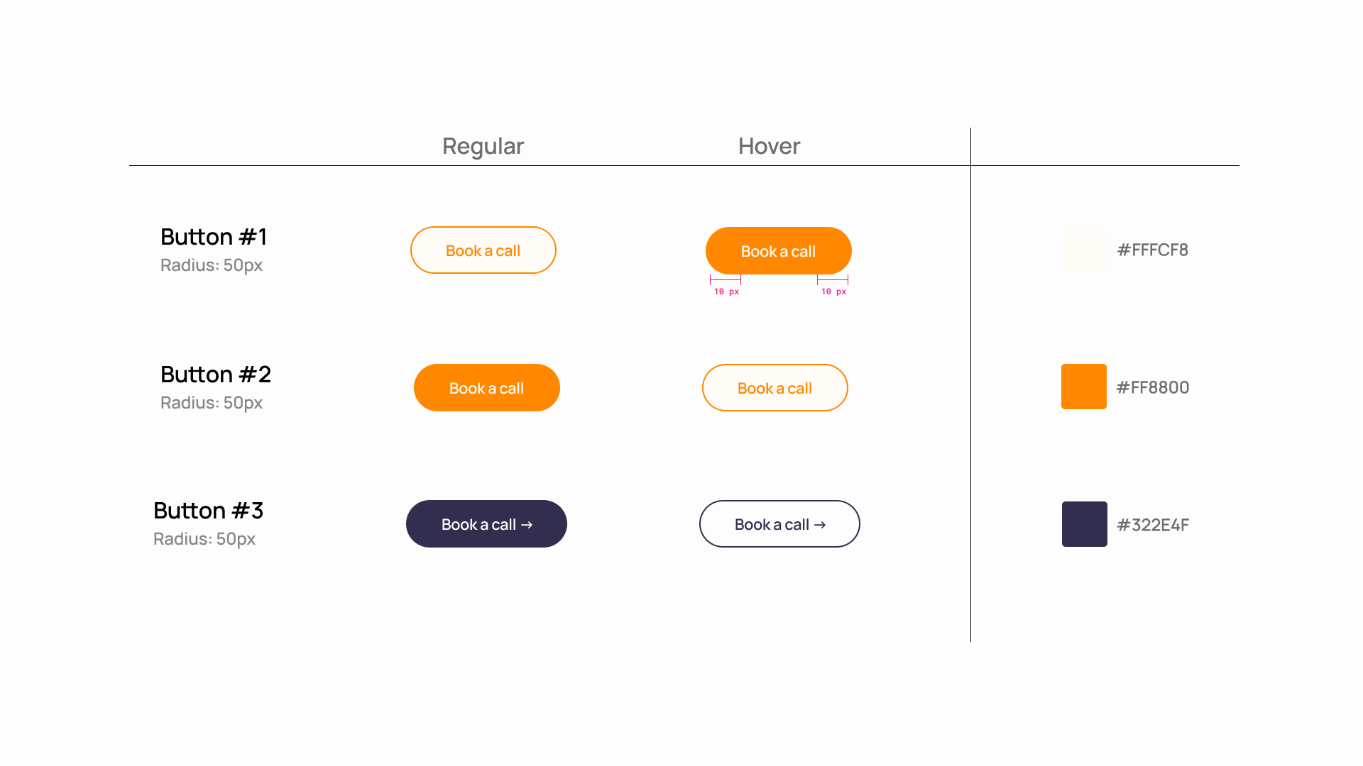
Button States
-
![]()
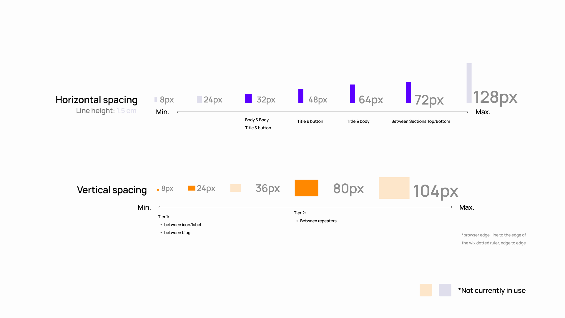
Spacing Guide

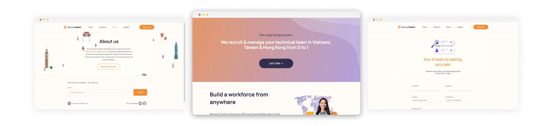
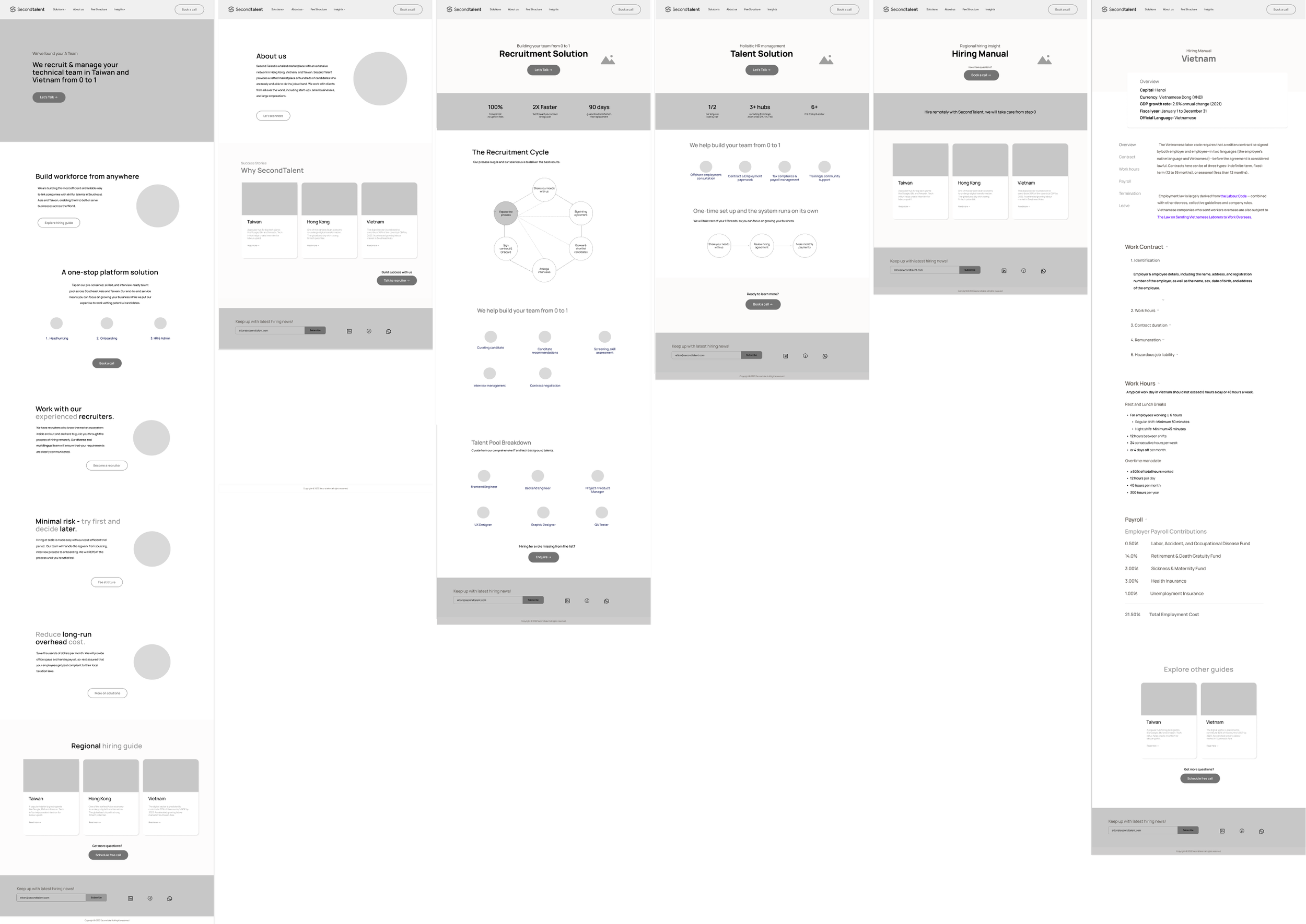
3- Final Product
Migrating the prototype into Wix Platform and working through iterations with the team. An important process is to help install fonts and to configure the UI System into the page-builder backend. This way it streamlines the workflow of future editors.
04 - Reflection
In a perfect world, designers might be able to go through the entire development process before publishing the product, but that is rarely the case. I learned to work within constrains of funds and tools. I had no resource to user test, so I rely on secondary research on web practices, industry comparative analysis and internal testings.
I also have to be quick on my feet in learning the constrains of design tools. As our client wants to launch the site on Wix, I have to be agile, and that means cross-experimenting between Figma and test pages on Wix to test the capability of the design tool in reifying the prototype.
Working with constrains
In the early stage of building, I found myself switching between designing and building. Given the time constrain I learn to remind myself to stick to the spacing and type scale created. This makes the process faster and would make hand-over much easier for future editors. I learned about the 80/20 rules and how it should inform my task priorities; Delivering on big tasks and focusing on the user experience as a whole is often much more impactful than fixating on minor details on-the-fly that might only contribute to a minor percentage of the experience.
Practicing consistency